How to mix and match Benjamin Moore’s 2020 color palette
Friends and color aficionados worldwide:
Greetings and Happy New Year 2020 again to you all. Thank you as always for your readership. This is the first year of my life that I focus on regular blog posting, so let’s just say that it really is a “New Year, New Me” type of start to the year. I’m going to enjoy the challenge most certainly.
DISCLAIMER: This is a promotional post and I am being compensated to write about SRH Paint Co and Benjamin Moore products. The opinions, however, expressed here in this blog are my own. I’m not a fan of pushy sales copy type of blogging. My job as I see it is to explain WHY I back these products, HOW I use them and then to equip you with some color knowledge!
Though the focus of the weekly blog concerns Benjamin Moore products and the paint world, I’ll always put my spin on it with interesting color combinations, pictures of projects I’m completing, and/or color anecdotes.
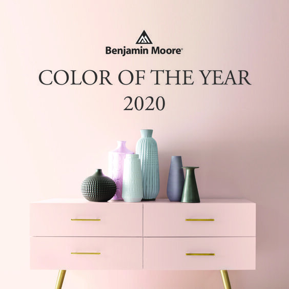
Let’s jump right in with a chat about the Benjamin Moore 2020 Color Palette, anchored by their color of the year, FIRST LIGHT 2102-70. Described by the good folks at Benjamin Moore as “the backdrop for a bright new decade,” First Light is a “rosy hue blooming with potential.”
Again, per Benjamin Moore, “the ten harmonious hues of the Color Trends 2020 palette, including First Light, deliver modern paint color pairings that combine optimism with understatement, a timeless way to lighten up.”
Today I want to show you how the colors are being used individually, as well as how I personally would combine them. I’m a huge proponent of creating interesting color combinations, and this year almost every color within the palette combines quite well with the others.
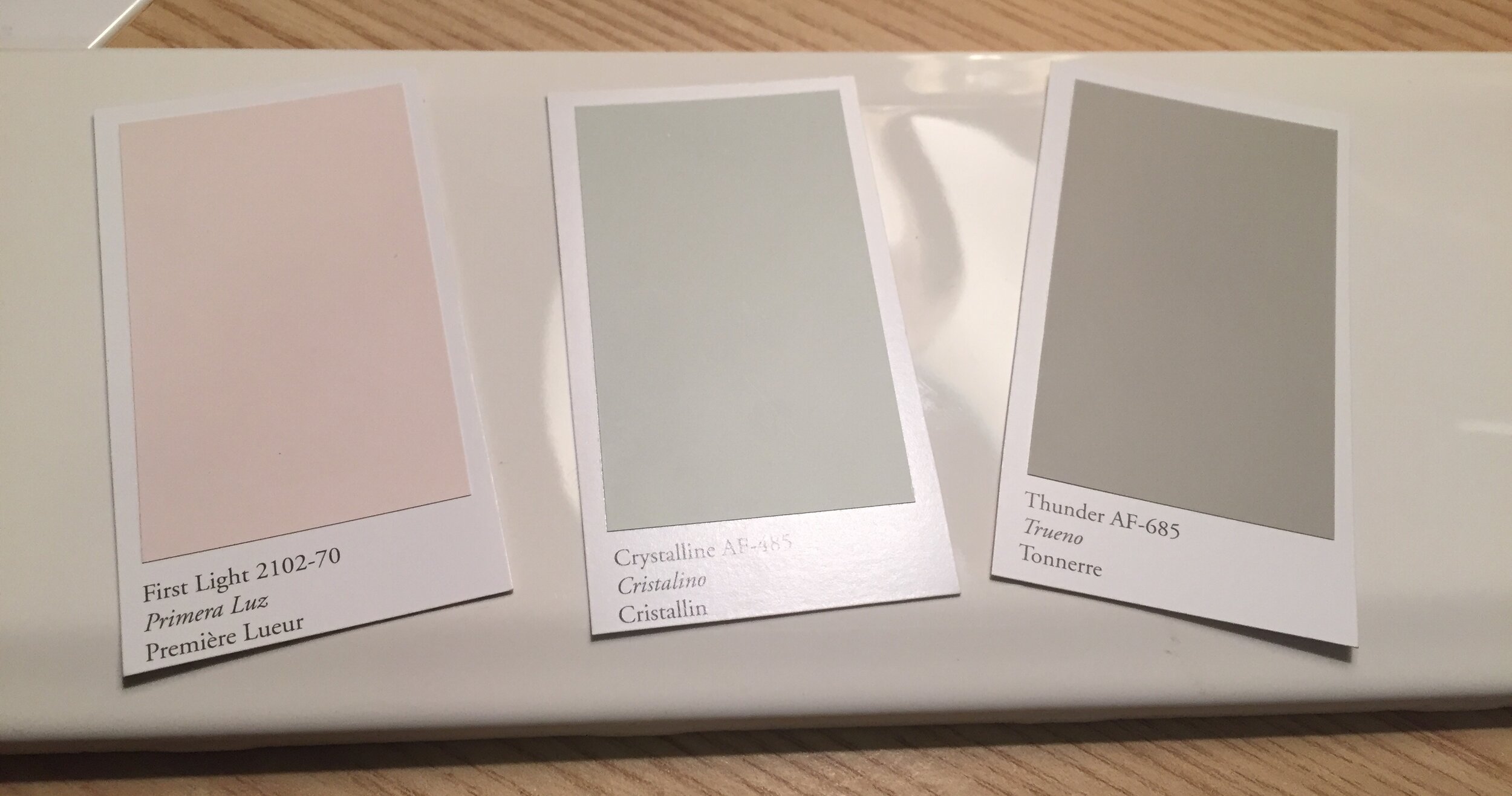
First Light 2102-70 (Part of Benjamin Moore’s COLOR PREVIEW collection)
L to R: First Light 2102-70 | White Heron OC-57 | Thunder AF-685 | Oxford Gray 2128-40
The above color combination features First Light 2102-70 set against White Heron OC-57 from the Off Whites collection of Benjamin Moore color. I added another greenish gray in Thunder AF-685 and a blue gray named Oxford Gray 2128-40.
Wall color in Thunder AF-685 from the Affinity collection by Benjamin Moore
L to R: Golden Straw 2152-50 | Crystalline AF-485 | Cushing Green HC-125
The above combination works because the colors are all about equal in saturation, chroma or intensity. That is to say that none of the colors are too vibrant or muted for the other(s).
COLOR TIP: Keep intensity of colors consistent when mixing and matching. Bright or clean colors harmonize with other bright/clean colors, and muted or muddy colors pair with other equally muted/muddy colors. PRO TIP: All of the colors in Benjamin Moore’s Affinity collection are quite toned down and can be mixed and matched in almost any combination.
Kitchen wall in Golden Straw 2152-50, part of Benjamin Moore’s newest Color Preview collection
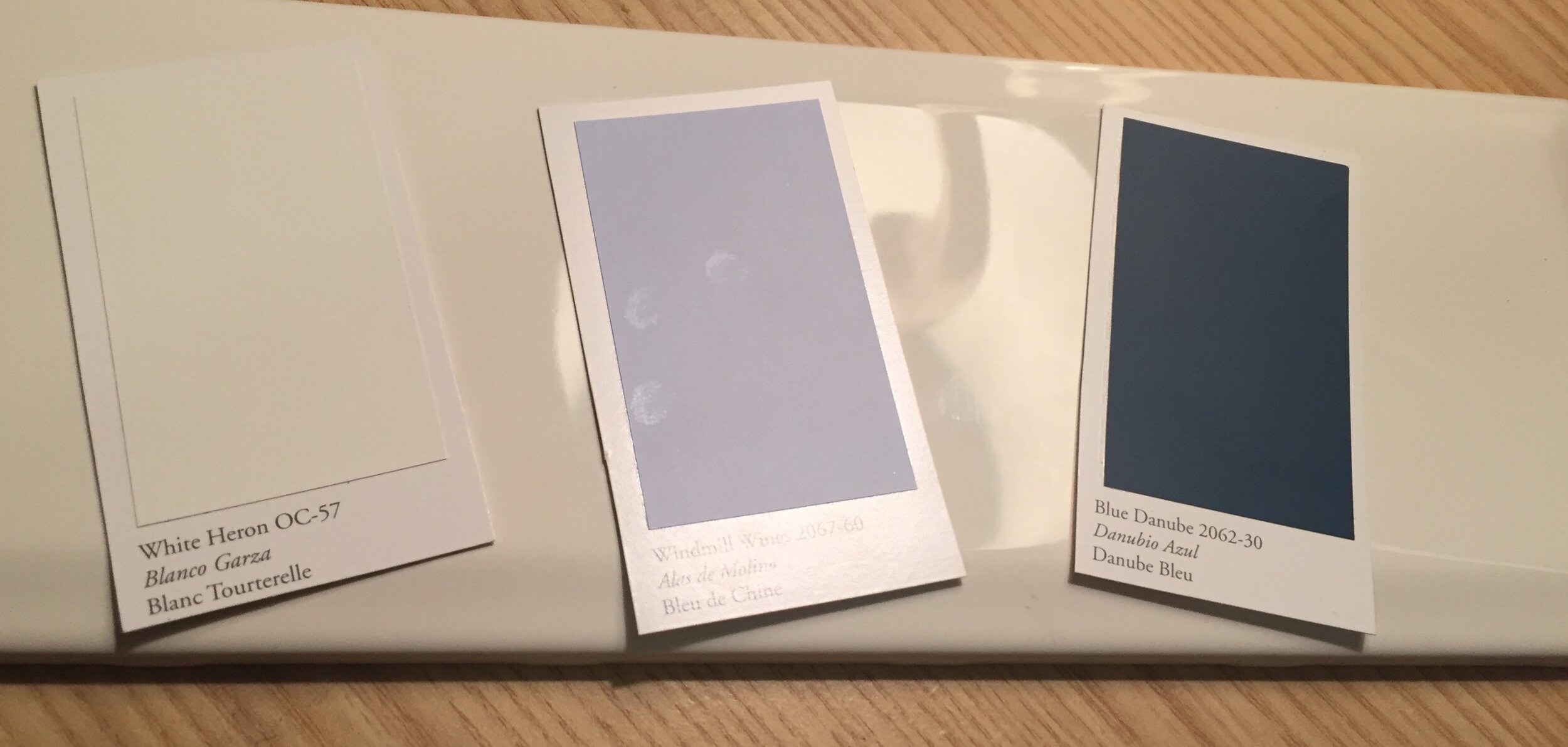
L to R: Windmill Wings 2067-60 | Buxton Blue HC-149 | Blue Danube 2062-30
This year’s color palette features three distinct blues shown above. My favorite, favorite, favorite shade is the light blue-yet-teetering-on-the-edge-of-periwinkle tone of Windmill Wings 2067-60. Earlier I said that all 10 of the 2020 colors mix and match pretty well, and of those Windmill Wings 2067-60 is my personal VIP color. Read on to see how I pair it with other colors in the palette.
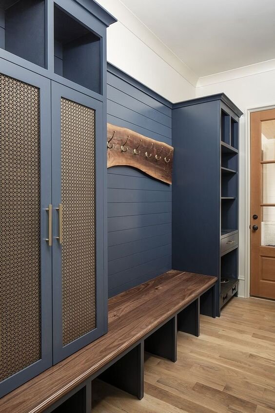
Buxton Blue HC-149, from Benjamin Moore’s Historical Collection palette, is a warmer blue with hints of green. Blue Danube 2062-30 at first glance some say it appears to be a type of navy. Look again! It is a deep teal blue by my eye, as there’s a lot of green in it. I’m loving this alternative to the very requested Hale Navy from 2018 and 2019!
To illustrate my point about these two “navys.” the color above on the left is our good old Pinterest standby Hale Navy by Benjamin Moore. It is a lively navy, but a navy nonetheless. PHOTO CREDIT: Home Bunch
Blue Danube is featured in the image on the right. Can you see how much warmer the blue is, moving it into teal territory? I love it. PHOTO CREDIT: Coco Kelley
Now, how do I combine the colors in the 2020 Benjamin Moore palette? See below for some of my happiest trios of color:
L to R: First Light 2102-70 | Blue Danube 2062-30 | Cushing Green HC-125
L to R: First Light 2102-70 | Cushing Green HC-125 | Thunder AF-685
L to R: First Light 2102-70 | Crystalline AF-485 | Thunder AF-685
L to R: Thunder AF-685 | Windmill Wings 2067-60 | Cushing Green HC-125
L to R: White Heron OC-57 | Windmill Wings 2067-60 | Blue Danube 2062-30
L to R: White Heron OC-57 | Windmill Wings 2067-60 | Thunder AF-685
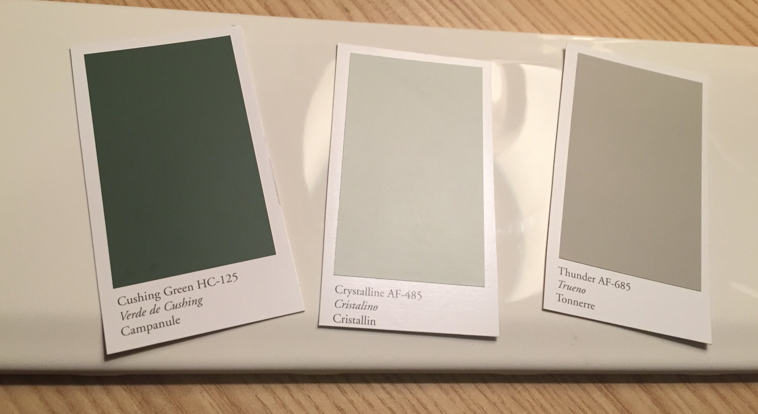
L to R: Cushing Green HC-125 | Crystalline AF-485 | Thunder AF-685
L to R: White Heron OC-57 | Blue Danube 2062-30 | Golden Straw 2152-50
An important tip to remember when considering paint colors for your space is that this color palette is designed to inspire you, but ultimately your paint is what you pick last.
Why? Well, we have over 3,500 Benjamin Moore color choices plus options to customize any color, while you have a very finite number of colors available in the decor world. Maybe you find a throw pillow, rug or piece of art that is inspired by Windmill Wings 2067-60 for example, but it is more periwinkle. Well, we can select the paint color once all other decor and surfaces are procured to capture just the right hue.
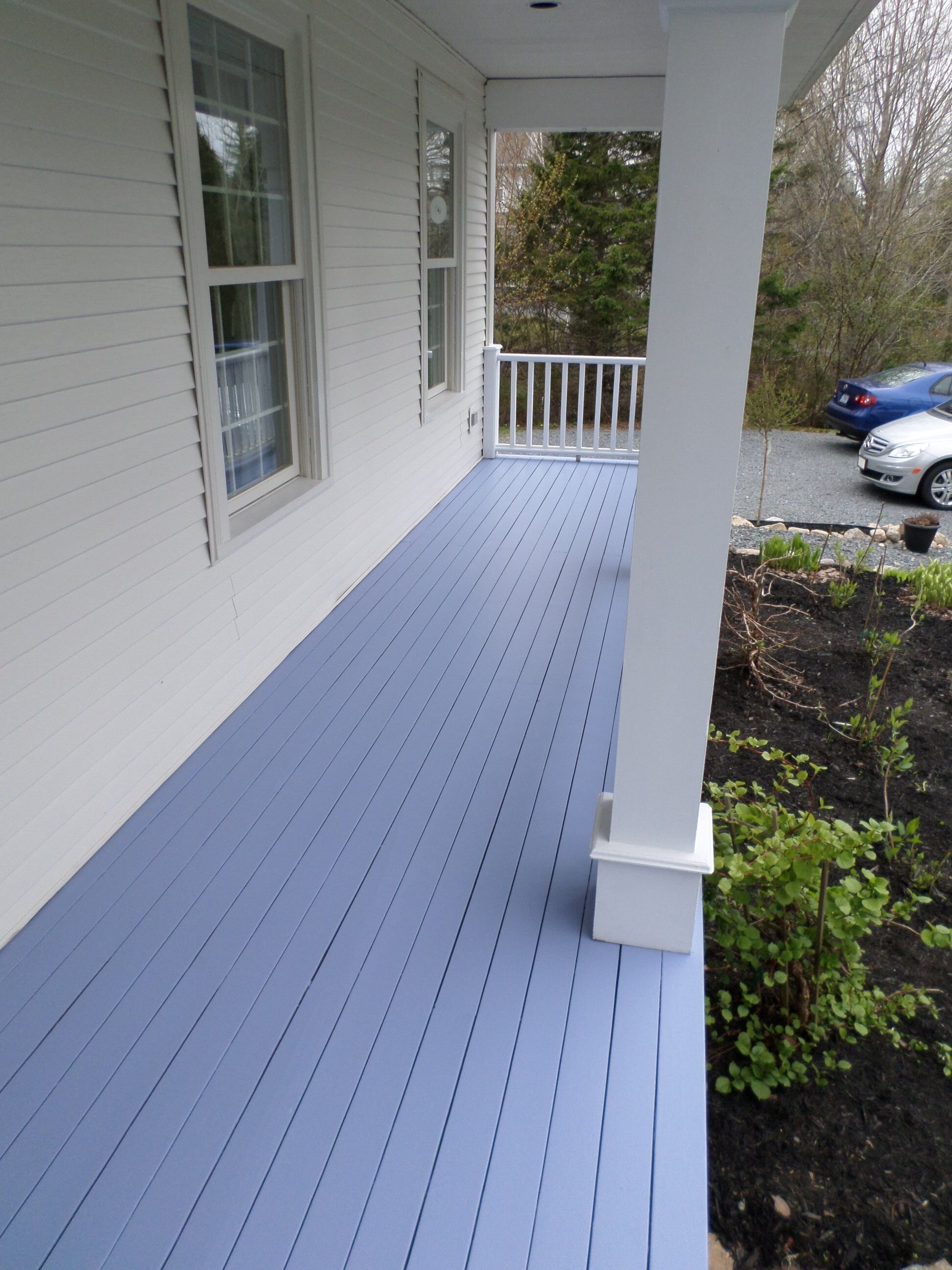
I found this interesting use of Windmill Wings 2067-60 on an exterior porch for a dose of color (above left) PHOTO CREDIT: My BM 2020 Inspired Pinterest Board
This image above right from Subway Tile Outlet features the very on-trend idea of a baby blue with hints of purple, giving it a periwinkle cast.
Friends, I’m signing off for now but welcome you to comment below and/or reach out to me via email or phone with any color related questions or quandaries you might be having.
Coloring my way across the globe,,,,,,,,,,,,,,,
Lauren

