Bright & fun color pairings
Hey, color understudies and enthusiasts alike! It’s your color girl Lauren writing from my color studio in The Woodlands, Texas, U.S.A. Where are you? Please let me know in the comments.
Today we are playing “show and tell” with three interesting color combinations that harmonize well but that seem unlikely to the novice eye. I will show you the Sherwin-Williams paint colors first as a pairing, then we will explore real life examples of comparable color pairings. Vamonos!
DISCLAIMER: No, the good folks at Sherwin-Williams are not compensating me for this blog post. The color opinions expressed are solely mine and not for the purpose of promoting Sherwin-Williams products.
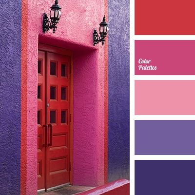
Below left: Exuberant Pink SW 6840 Below right: Eros Pink SW 6860
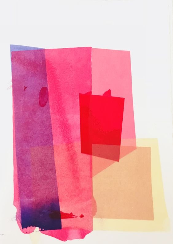
This Liz Roache art print below best depicts the way that Exuberant Pink and Eros Pink interact. The digital paint swatches at the beginning don’t accurately depict the color tones in my opinion.
In the art piece below, the top square is a very purple-pink similar to Exuberant Pink. The middle square has more red added and is thus a warmed red-pink. Both of these hues in real life appear to be pink, yet next to each other they appear red and purple. This is the power of seeing colors in conjunction with one another!
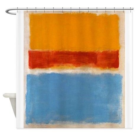
Below left: Obstinate Orange SW 6884 Below right: Fabulous Grape SW
Both colors above read a bit cooler on the screen than they appear in real life. Obstinate Orange really is a vivid warm color, and Fabulous Grape has more red in it, making it almost seem like a vibrant eggplant tone.
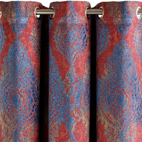
Below left: Habanero Chile SW 7589 Below right: Major Blue
The Habanero Chile color as you can see is quite spicy and warm, while our Major Blue is a spunky, vibrant mid tone blue. Let’s see some visuals for inspiration.
Have you noticed a common theme among all of these colors? What is it? How would you describe the colors individually and as a whole? The answer is HIGH CHROMA.
High chroma colors are very pigmented, pure, strong, clean as some in the industry would say, and vibrant. The darkest color in the palette is Fabulous Grape, yet it still holds its own as a high chroma color.
Which of these color duos appeal to you the most and how could you see yourself incorporating them into your current living or work space? Tell me more in the comments or email me any questions. Your question may become my next blog post!
Until next time and colorfully yours,
Lauren
