LFB Color Study 1: When Landscaping Dictates The Color Palette

Color enthusiasts the world over:
Greetings to you all and well wishes for a brilliantly or serenely colorful Monday! I’m experimenting with a new format on my blog through small color studies of projects recently completed.
Architectural color consulting affords me the honor of specifying color on all types of projects, from residential to commercial to multi-family and real estate investment properties. At LFB Color Consulting, we select color for all finishes such as paint, stain, roofing, counter tops, metallic finishes, wallpaper, at times drapery and upholstery fabric, and of course flooring. We are involved anywhere even the smallest color selection is made!
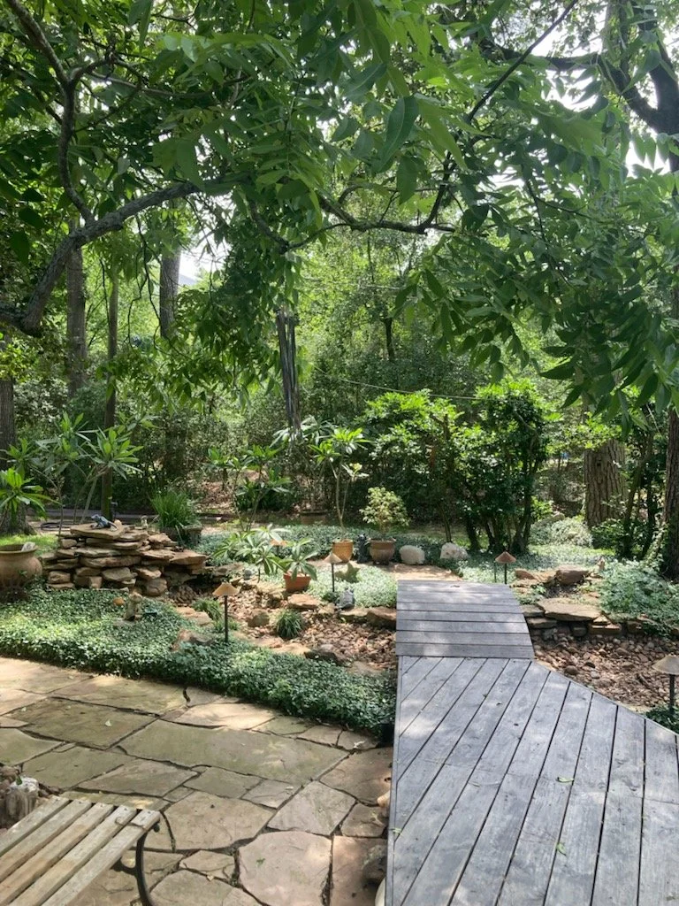
Check out this amazing landscape and verdant backyard oasis! During the initial discovery call with my client, we discussed that he wanted a refresh and something modern for his home, which also has a detached and enclosed office space where he operates his business. My client was about to order a brand new roof in a pitch black color, so we had to discuss that as a change during our in-person consultation. You’ll see why in a moment!
In essence, he wanted to take the color palette from this warm beige tone to some form of gray. See the before images below for comparison.


Now that you’ve had a view of the before images, please review the below result of our consultation. My client kept asking for grays, but it was essential that we create a color palette with the appropriate gray tones. Remember, folks! I’m not the color police. My role as consultant is to provide viable color, materials and finishes options in keeping with my clients’ requested aesthetic and vision. See below…..

Why wouldn’t I approve a black roof, and a very solid and saturated one at that? The answer is simple: EVERYTHING surrounding my client’s home is much more toned down or soft. A solid black roof would have overpowered the house and looked out of place! We chose instead a roof with multiple tones of off-black, soft browns and even grays present in them. We had to tone it down to match the surroundings.
DISCLAIMER: These photographs were taken by me—-clearly not a professional photographer. Please be patient as I work to improve my photography skills!

Ultimately I chose a color palette utilizing green-gray tones (SHERWIN-WILLIAMS Useful Gray and Adaptive Shade) and an off black third color (SHERWIN-WILLIAMS Iron Ore) for metal poles and other accents. I also selected a new deck stain for my client using MinWax brand stain in a color called Alluvium. What influenced my color selection most for this client was the gorgeous green landscaping.


My top color tip for you DIYers out there is to always consider surrounding elements such as landscaping and architectural elements (stone, brick, siding) that will remain unchanged when you are selecting color palettes. All elements must relate to one another to create visual harmony.
Have a colorful week, my friends!
Lauren